The objective for this project was to create an e-commerce brand and website for an art and design supply shop, with a target audience of post-secondary students. The ideation phase involved heavy brainstorming and research to create the concept of Noctua based on Athena's owl, known to accompany the diety in matters of the arts.
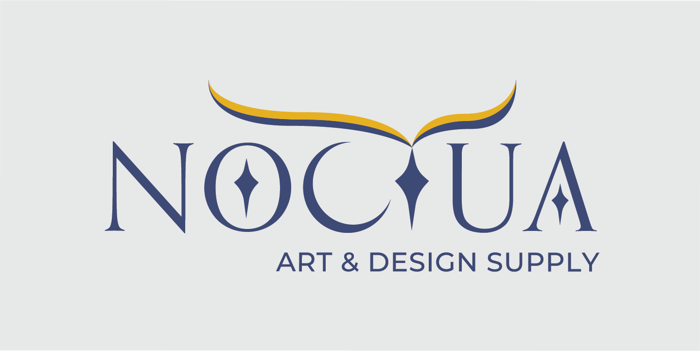
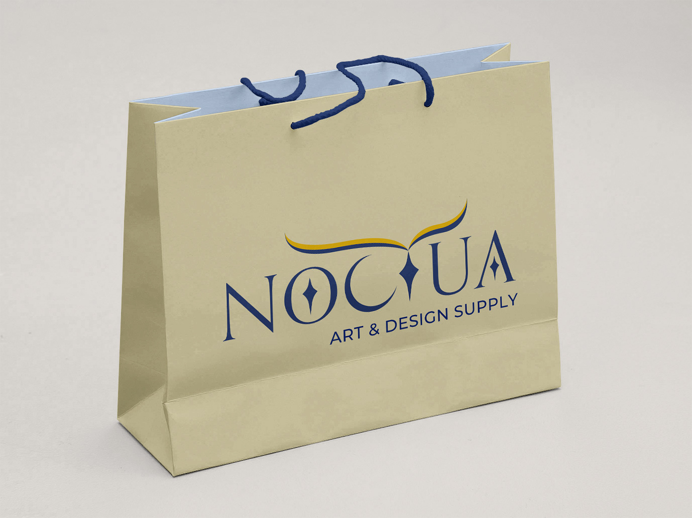
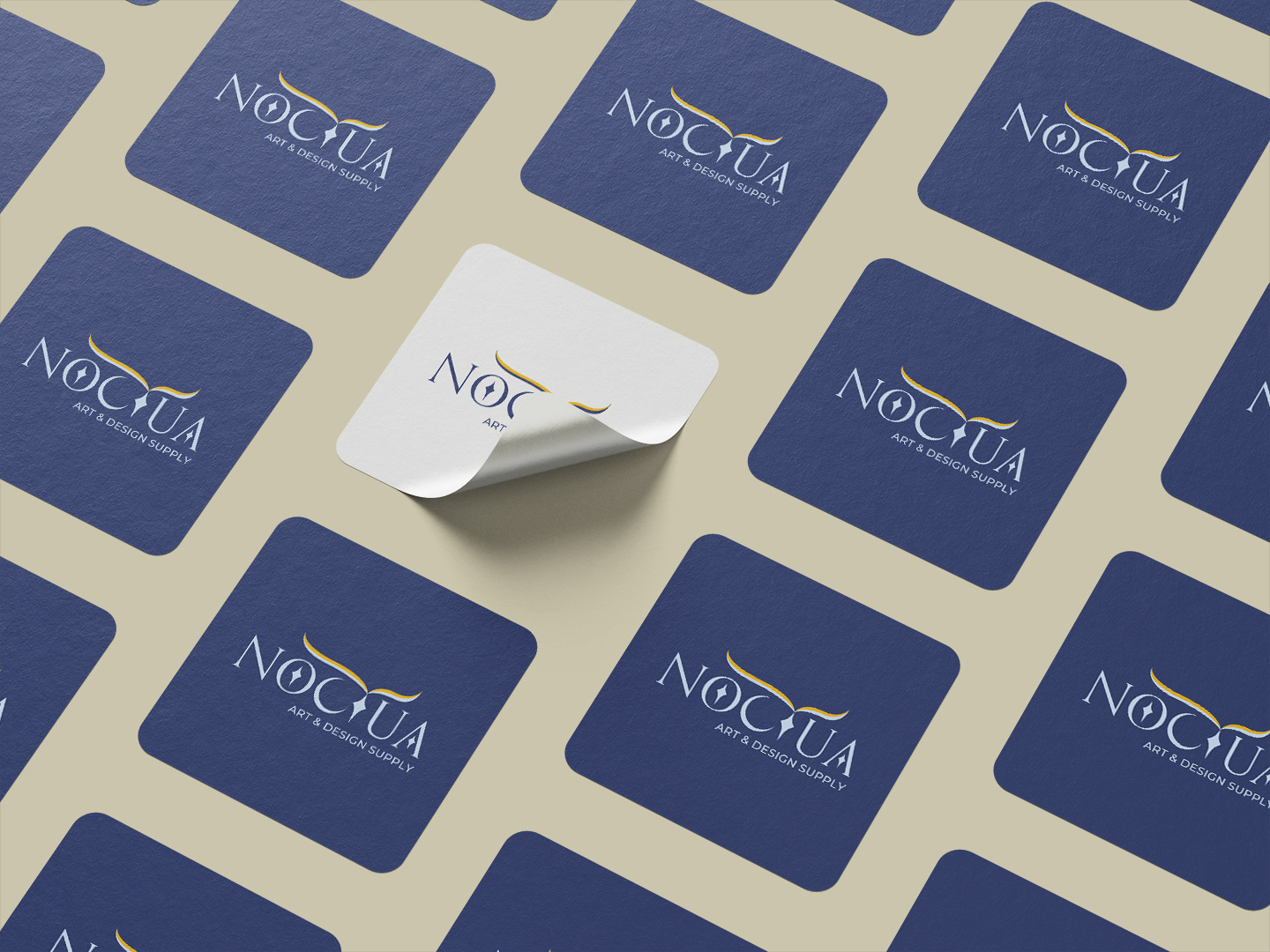
The Noctua wordmark is meant to be traditional and elegant, using the Orpheus typeface to represent these values. The swashes are meant to represent the owl's brow, watching and observing. Stars within the counters of the "A" and "O" give balance to the "T", which acts as a beak. Gold and light navy blue show the academic nature of the supply store.
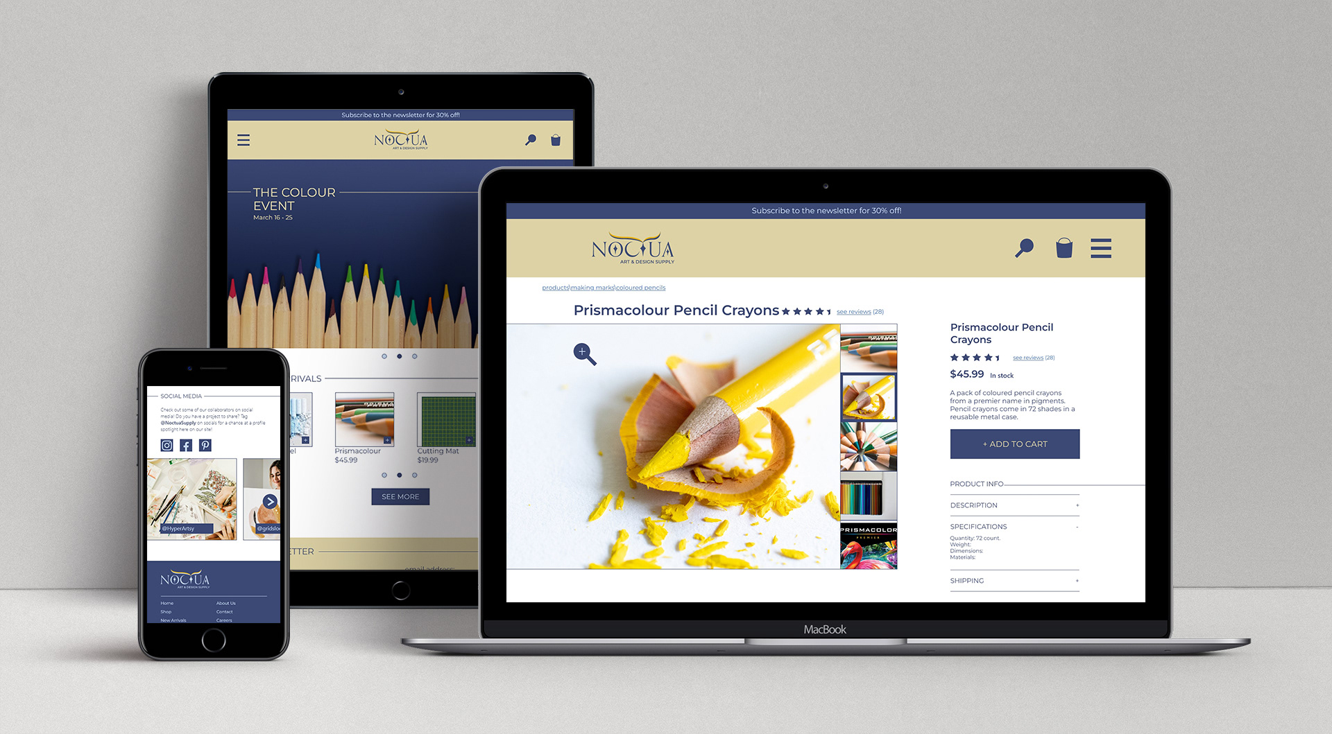
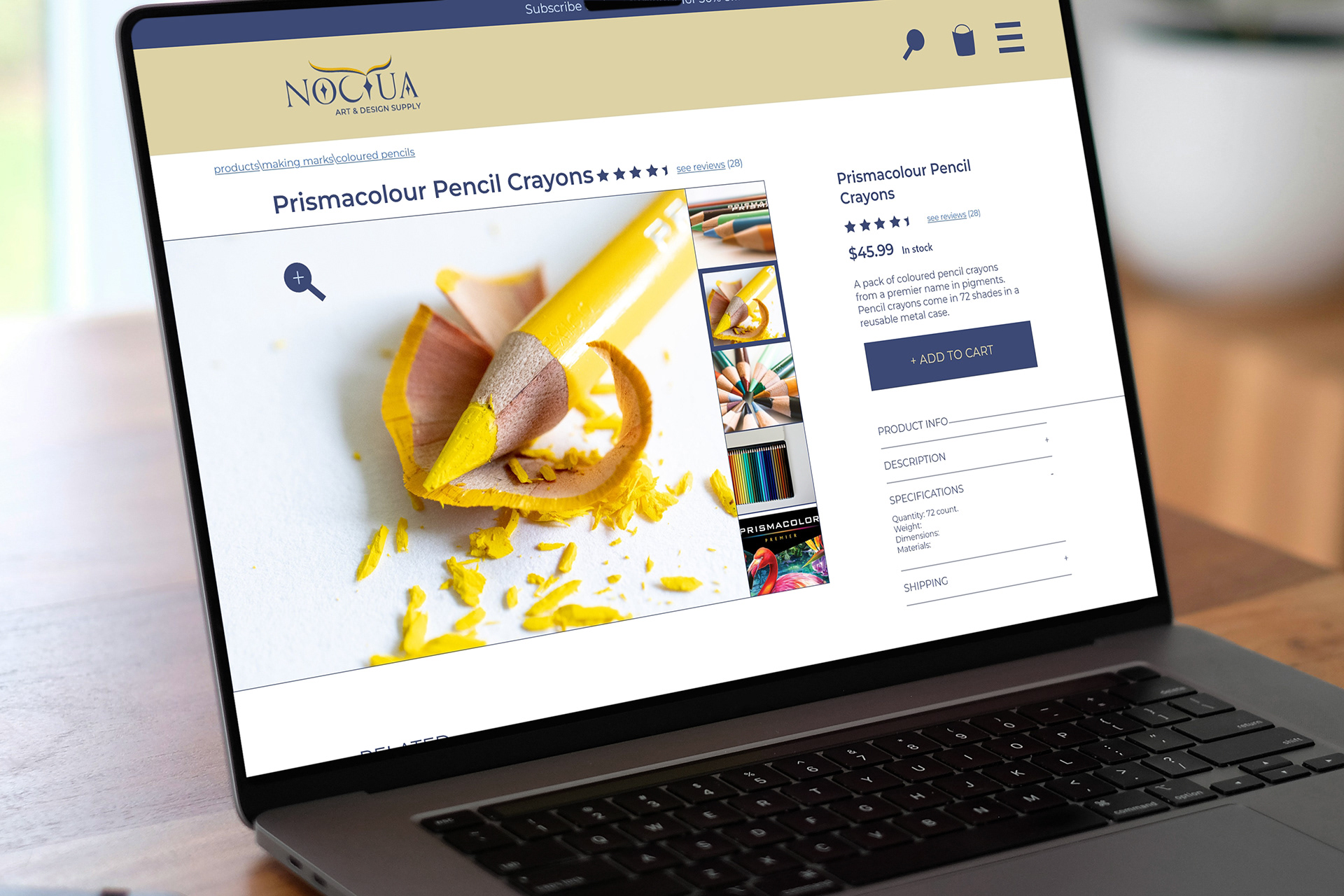
The web site design was focused on consistent responsive breakpoints and effective interactions. The home page is minimal, using brand colours sparingly to allow the colourful product images to stand out. Montserrat was chosen as a corporate typeface because it pairs well with Orpheus.